There are three flags on these 1998 Italian stamps: Italy, Sardinia (also know as 'The four moors flag'), and the European Union.
The stamp celebrates the International Fair of Sardinia, held in Cagliari every year since 1948 in its current form. I don't know if Italian stamps valued in lira are still valid as postage (there was a 2 euro stamp on the card also).
And in the US flag stamps are ubiquitous. Here are two I received in the mail during the past two weeks.
On the left is 'U.S. Flag' designed from a photograph, issued in 2019, and on the right is a graphically designed 'U.S. Flag' issued in 2018. I hadn't noticed that they have the same name - in the past I remember the flag stamps having their own distinct names. The 2018 stamp takes its cue from another stamp issued in 2018 to commemorate the centenary of the Flag Act of 1818. The Flag Act formalized the design if the US flag - thirteen horizontal stripes and a star for each state - as well as the fact that changes to the flag after admission of a new state would always occur on Independence Day, July 4th.
Bonus:
Inspired by CJ's comment, here's more on the flag stamps issued by USPS over the last 10 years, and whether I am a fan or not.
2020 "U.S. Flag stamped envelope". Graphic design.
No U.S Flag stamp issued (so far). There is a flag on the prestamped envelope - I am not a fan of this design (it reminds me of that roasting pan in the oven). The stars around the edge are a nice touch.
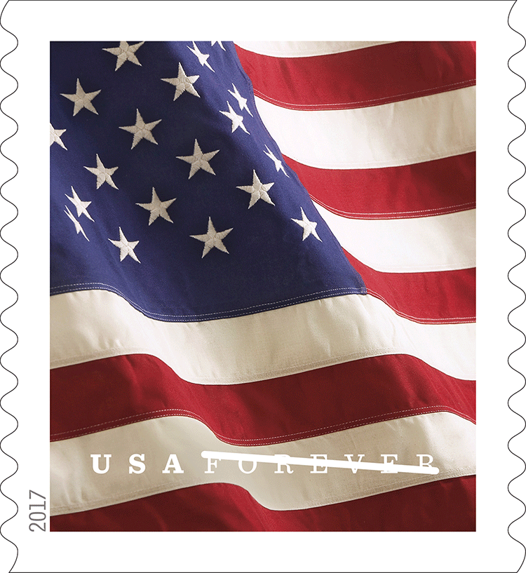
2019 'U.S. Flag'. Photo.
See main post. I wish there was less white space on the stamp.
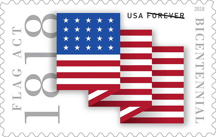
2018 'U.S. Flag'. Graphic design.
See main post. It's OK, not my favorite of the graphic design flags. It's counterpart celebrating the Flag Act is a bit strange - that would be one oddly shaped flag if fully extended.
2017 'U.S. Flag'. Photo.
I like this close up detail of the flag.
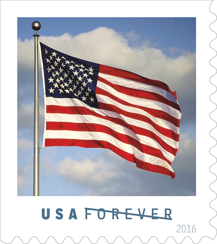
2016 'U.S. Flag'. Photo.
Better than the 2019 design.
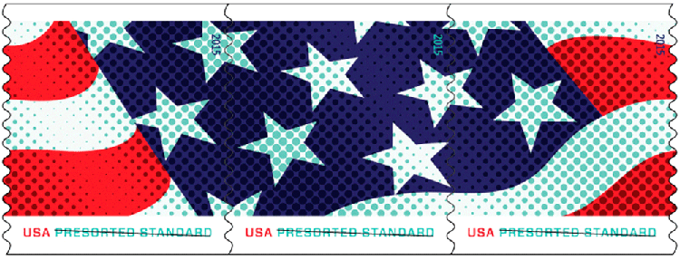
2015 'Stars & Stripes Presort Coil'. Graphic design.
There was no first class flag stamp issued, however there was a design of 3 stamps (that look best when seen together) at the presorted rate. I love this design, and would have enjoyed this at a first class rate.
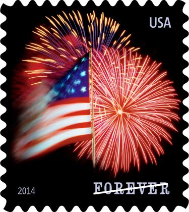
2014 "Star-spangled Banner". Design created graphically from a photo.
This was different take on the more classic approach to flag stamps. I liked this one, and used it on mail. I remember some people not liking it because the flag was a little blurry. I believe the idea was to represent the flag in motion.
2014 "Red, white and blue". Graphic design.
This is my favorite of the graphic designs of the past 10 years. I remember reading some comments from people who despised them as too abstract. I believe it was only issued as a coil set. I bought a strip of them back when the post office sold strips of 20 stamps - not sure if the philatelic service still does that, lately I've been seeing strips of 500 being offered (coils usually come in 1, 5 or 10 thousand).
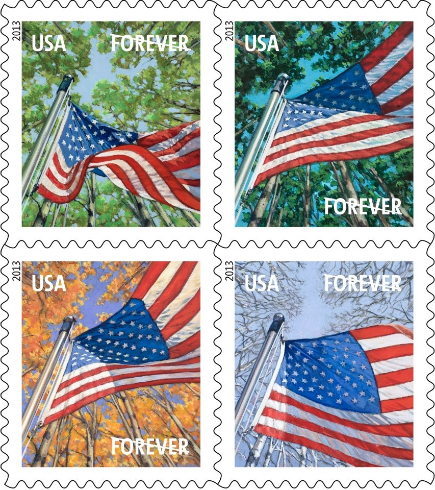
2013 "Flag for all seasons". Art design (possibly made/inspired by photos)
This was a nice take on a set of flag stamps, although hard to depict a difference from spring to summer though.
2012 "Four flags". Art design.
I believe this was a very popular set. I don't have a strong opinion on it.
2011 "Lady Liberty and Flag" Photo design.
I liked these stamps, although the Lady Liberty turned out to be a photo of an imitation in Las Vegas. Note that USPS since dropped the 'first-class' from their first class stamps, and just use the 'forever' term.
So it looks like giving (slightly) more descriptive names to the flag stamps stopped in 2016.


I didn't know that about the flag stamps. I had a conversation several months ago with Jeff at the post office. He didn't like the stylized stamps. Thought they were ugly. We both agreed the best flag stamps were the porch series where the stamp was shown on a front porch with clouds and sky as a background.
ReplyDeleteIt depends for me - some of the graphic designs I love.
DeleteYour comment had me do a little extra research which I added to my post.
Whew! Because I was thinking, what the? I missed most of the post? 😺
Delete:)
DeleteI think you can use stamps denominated in Lira. In Spain, however, we can use only stamps issued after January 2001. It's a pity!
ReplyDeleteAnd you're right: USA flag is ubiquitous!
Interesting post :)
Not sure if it updated before you left your comment. I mostly don't buy the flag stamps - too many other interesting subjects to send on mail.
DeleteWow, you have been busy this morning doing research!
ReplyDeleteI'm not a big fan of flag stamps just for the sake of showing the flag - we all know what it looks like! (We had a series, or two, with the flag showing too prominently with pretty scenes in the background.) The flag for all seasons set is nice. The graphic ones with the accordion folded flags are not.
CJ's question had me all curious. I am not really a fan of the flag stamps - there seem to be to many of them that looks similar.
DeleteI like the Sardinia stamp, showing old and new architecture and the three flags.
ReplyDeleteA nice stamp, and informed me of something I'd never heard of before.
DeleteYou did your philately homework... :)
ReplyDeleteI realise that I have got half of these. I'm not a great fan of flags on stamps. I definitely wouldn't buy those stamps in my country! But some of the designs are nice, like the seasons, the 2017 stamp...
I'm sorry, but the 2020 seems a bit like bacon...
:)
DeleteA fascinating exploration of recent flag stamps, I like the variety, something for everyone.
ReplyDeleteI've seen the Corsican flag with the Moor's Head but didn't know that Sardinia used a variant of it too.
I had to look it up - quite an unusual flag.
Delete