Thursday, November 28, 2013

Envelope 102

I was leafing through the envelopes to send Jean a better one than last time, and came across this.


This stamp, one of 2012's Earthscapes, ended up being a perfect match. I was really surprised that an envelope made in 1992 would, 20 years later, match a stamp almost perfectly. Jean liked it, and called it 'whirl-badger', which I like.


I decided to let the stamp be the focus, and went with simple addressing. I do like how nice this font (Gill sans) looks on the envelopes, this may end up being my default.


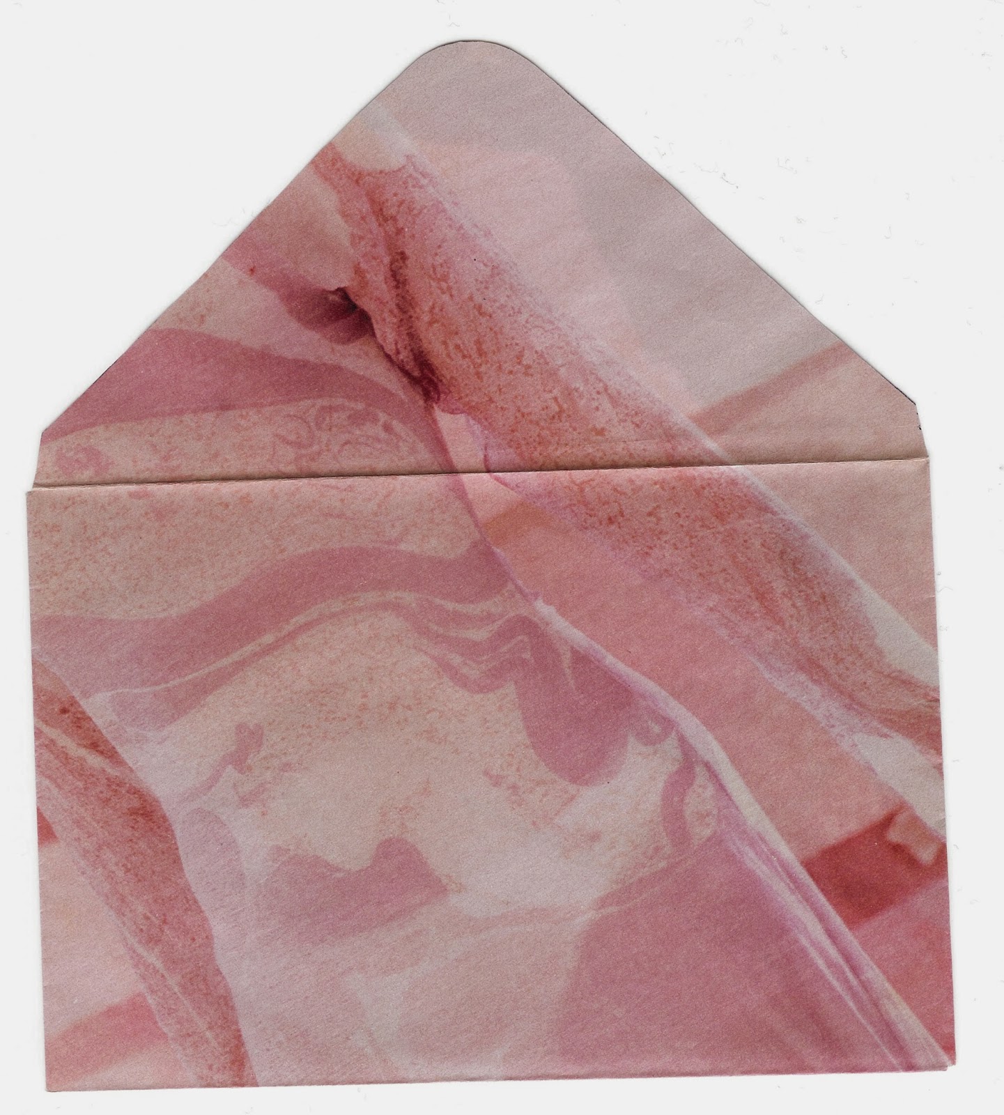
And, as always, the back. I like how 2 of the flaps were dark, and 2 (mostly) red. Unintentional, as always.


Saturday, November 23, 2013

Envelope 94

I forgot to scan the envelope before I put the stamp on. From what I've seen, the Johnny Cash stamp is proving to be very versatile, something I wouldn't have expected.

Stamped:


This is another one made form glossy magazine paper. I'll be avoiding it in the new set as it is very flimsy, and the recipient almost threw it away as it looked like just another piece of mail advertising! Just as well the address was pretty bold.


And, as always, the back. I like the pattern the violins made, and love the legs that wrap around from the front.


I sent this one locally - this is another one that arrived uncencelled and unlabeled by the PO.

Friday, November 22, 2013

Finnbadger envelope on local French TV station...


Unreal.

Tony M's blog post today has a link to a TV segment about him and his Mail Art/Faux Stamps and my 3D envelope shows up in the clip!

Link to TV video (all in French). The link takes you to the start of the segment about him. 

Here's a screen capture.


Astonishing.


Tuesday, November 19, 2013

Envelope 110

I think the pattern on the dress and background was unusual enough to make it into an envelope, but also hard to choose a stamp for it. This is one made of thin, glossy magazine paper - not the most durable.

Probably not one of my most creative ones; fortunately the next one sent to Jean W was better.

Envelope 110:

Stamp chosen to somewhat match the pink (pity there isn't a pink 'waves of color' stamp - although maybe the $1 waves stamp would have been better...)


Lettering colored to match the stamp. I did like how the blue looks with this font:

And the back:


I didn't realize how obvious the underwear was until after it was stamped,addressed and sealed to send! Ah, well, such is life. Don't worry, I don't think there'll be an 'underwear' subseries.


Monday, November 18, 2013

Tennis elbow


I love how Jean W can write across the envelope, filling the width so perfectly. I don't think I'd ever be able to do that in loopy letters... elbow-itis would kick in first.

Nice yellow on the dots to match the tennis ball, too.

Thursday, November 14, 2013

4th World Day of Faux Stamp Artists part 2

Sheets of the London Underground Map writing stamps with the 'Mail Art' label added.


Update Nov 16.

Apparently Tony liked these so much he is going to use them on his outgoing mail. (Google translate does a pretty good job of translating Tony's French blogging into English). He has received so many amazing faux stamps in his mail art project it is well worth browsing through his updates.

And Jean W liked the envelope, so she has reblogged it. So crazy to have this envelope on 3 different blogs.


Monday, November 11, 2013

3D address 2 - air mail art

Tony M has a great mail art blog.

Currently he is running the 4th World Day of Faux Stamp Artists celebration. This is being run in conjunction with La Poste, the French post office, so that they will actually allow mail to be sent to Tony with a fake stamp. I cannot imagine that happening with the USPS.


This time I used google translator to get a better idea of what I should be doing :)

I liked the 3D effect on the envelope I sent to Jean W, so thought one for Tony would be good. I accompanied it with a faux stamp. The only letter I'm not super happy with is the V, but not sure if there is a better solution.


And playing around Warhol-style... (I sent these to Tony)...

Update:

It arrived! This one did get cancelled, and also managed to gain an 'FD' stamp, which, as far as I can gather means 'false direction', meaning it probably went astray in the system for a day or two.


Friday, November 8, 2013

4th World Day of Faux Stamp Artists - air mail art

Tony M has a great mail art blog.

Currently he is running the 4th World Day of Faux Stamp Artists celebration. This is being run in conjunction with La Poste, the French post office, so that they will actually allow mail to be sent to Tony with a fake stamp. I cannot imagine that happening with the USPS.

To date only Belgium has issued official stamps that feature mail art. Scroll down Tony M's post to see one.

I don't speak French, so I didn't quite get all the specifications right (I was supposed to put the words 'Mail Art' somewhere on the stamp. I may retrofit the words in there.

Here's the stamp:


And here's the envelope I sent:


Edit: Tony received it, once again uncancelled! Tony didn't open it and thought it was anonymous - hopefully he reads my comment on his site. 

Quoting him: 'Une belle lettre. Un anonyme! Elle n'est pas oblitérée. D'où vient-elle? Des USA ?...' which google translated as, 'A beautiful letter. An anonymous (one)! It is not obliterated cancelled. Where does it come from? U.S.? ...' [I have made corrections to googles translation].

Looks like the centrally placed stamp was somewhat in disguise, and I love the fact that the French word for cancelled is basically 'obliterated'.

That's the second one I've sent him that is unfranked... hopefully the 3D one arrives this week to see what happens there, although those stamps are placed in a corner at least.

Thursday, November 7, 2013

Stamps - $1 waves of color


On the usps website I didn't think the waves of color stamps look all that impressive. Received one in the mail and it looks much better in person.

The packet came with a bonus puffin stamp, too.


Not sure my scanner did any better of a job of making the stamp look good - maybe it had some trouble with the lines.

Wednesday, November 6, 2013

Not one of the envelopes 5 - more Halloween stamps


Jean W reblogged my post about creating Halloween stamps from Ed Emberley inspired envelope art. She also reblogged a great envelope from Carol, which has some great orange highlights.

Here's what could be possible with some black and orange stamps to go with the black/purple ones.


And now I declare Halloween to be officially over.

Tuesday, November 5, 2013

Finnbadger 6


Just in from Jean W. 

This is probably my favorite so far. I like the way the writing echoes the style of the stamp, and the zip code looks perfect.


Monday, November 4, 2013

3D address


This is 'not one of the envelopes', although it is homemade. And by homemade I mean I printed it on a piece of paper then folded the paper into an envelope. As Jean W pointed out here, I did not pay attention to the aspect ratio, but the post office machine sorted it anyway at the standard rate.

Here it is prior to mailing:


Sunday, November 3, 2013

Not one of the envelopes 4 - Halloween stamps

Jean W always receives such interesting mail - I'd love to be her mailman!

We were lamenting the lack of Halloween-themed stamps, and this great envelope she received inspired me to think 'what if?'

Really, USPS, it wouldn't be that hard - this is what I achieved in about 15 minutes in photoshop...