Tuesday, December 31, 2013

Envelope 81 / Exchange 8

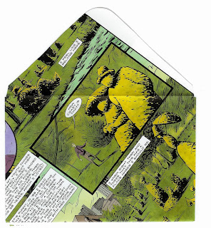
Here's the handmade envelope I sent to Jack M.


Since I placed the stamp on top of the pyramid-shaped address, there is just a stamp+address scan. I placed the global stamp upside down (as an aside, apparently some people have had trouble deciding which way up it is supposed to go - to which I say, it is all a matter of perspective, or maybe geography).


And as always, the back.


Happy New Year!

Monday, December 30, 2013

Exchange 7 - Mail Art with a capital M


Jan H sent me this piece of mail art - and by mail art I mean MAIL ART.


The stitching of the plastic outer 'case' is hard to appreciate on the scan (that's the zigzag pattern). The scan really doesn't do it justice, as the envelope has a lot of depth due to the layering of the paper strips. The contents look great - and the stamps used are an excellent compliment. I wonder if the contents of the envelope resemble Jan's brain?

Friday, December 27, 2013

Envelopes 68 and 92 / Exchange 6

Michelle sent me the great racetrack envelope as part of the exchange.

I first sent envelope 92... it is one of the 20 yr old ones, but I think it is a Georgia O'Keefe poppy.


I chose the O'Keefe stamp from the modern art set. I think it may have been a bit too large for the envelope, and perhaps competes too much with it for attention.


I tried to get the address to be a reflection of the red on black, but really it didn't work for me at all. The black is too stark, too square, too something. I felt that I had completely disfigured this envelope!


Fortunately I hadn't touched the back, which I think is stunning. Hopefully if Michelle displays this one she keeps it turned this way!


This is the problem with these unique envelopes. Once they're done, they're done - and so my options were to send it or trash it (and the stamp). So I sent it, and I also decided that Michelle deserved better, and sent her a second homemade envelope. I think this one worked much much better. 

Envelope 68 - another one on flimsy glossy magazine paper.


Stamped - I am really enjoying hiding Mr Cash in the black parts of my envelopes.


Addressed - I tried to evoke the name tags on the astronauts.


This one also came with a fun 'liner' - an orange that reminded me of a rising (or setting) sun.


And of course, the back.


Thanks to the inter webs, I could find out a little bit about the image on this one - it was from Capricorn One, a British film from 1977. Link to IMDB if you're interested.


Thursday, December 26, 2013

Exchange 5 - Gingerbread snow scene

As part of Jean's envelope exchange I sent everyone on the list one of my home made envelopes except Cathy. No real reason other than I had an idea for something that would work with the gingerbread house stamps, and I'd already sent all of my Christmas mail. (I'll have to remember this one for next year).

The stamp and dark blue 'sky' matched better in real life than they do on the scan (at least I think they did).

Hopefully this one didn't suffer any delivery issues.


Wednesday, December 25, 2013

Envelope 180 - Christmas Cookies

Thanks to everyone who has stopped by this blog - I appreciate the comments and interest.

I wasn't planning on sending any Christmas-related envelopes, then I found this magazine page...

Front:


Stamped:


Addressed:


The 'liner'... what better way to enjoy cookies than with a cocktail?


The back:


Merry Christmas, everyone!


Tuesday, December 24, 2013

Christmas Eve / Exchange 4

This one arrived from Smash. It falls within the 'exchange' window.

I'm not the most Christmassy person ever, however Smash's writing on this one is stunning. I can't imagine being able to write so well so large. That big red 'g' is spectacular. The colors go really well with the global wreath stamp, too. (Looks like it went through the sorting machine twice - I'm sure Smash will not appreciate the double barcode).

The front:


This is a really clever idea - the writing was done with the envelope opened up, then it was refolded and sealed again.

The back:


Monday, December 23, 2013

Russian dolls


This came.


A bit mysterious, particularly with the extra 's' added to my first name.

Opened up it revealed this:


Which, when opened up, contained these:


Thanks, Jean.

Now you can see that your own mail also gets special treatment by the post office - they even paid for the postage after their barcoding system incorrectly marked the envelope!

Friday, December 20, 2013

Envelope 95 / Exchange 3

Jean W requested this - she wrote that it is her new favorite. Hopefully Jan liked it, too (Jean didn't say). This is one of the vintage ones from 20 years ago, so I have no recollection what the article was about.


As part of the envelope exchange Jean organized, I sent out my handmade envelopes (with 1 exception).

Here's the one I sent to Jan. This one must have been part of a large newspaper sheet as I managed to get the main subject centrally located.


I had a couple of ideas about a stamp for this one to keep with the black and white theme. I really like placing the Johnny Cash stamp in unusual places.... the portrait above the seated woman almost had his face instead. Finally I thought the best choice was the Edith Piaf stamp. The lettering on the stamp is very subtle, you can hardly even see the 'USA' and 'Forever' on it. Even the dark red 'Edith Piaf' doesn't stand out. I liked the contrast between the severe-looking women on the paper and the sophistication of the stamp (and the woman on the inside).


For the address I went with simple sans-serif all caps on either side of the main subject's face.


One of the factors that swayed me to use Edith Piaf's stamp was the fact that the inside of the envelope shows part of a woman's face. 10 bonus points for identifying her.


And, as always, the back. The black and (faded) white gives a nice effect, and there's the third portrait.


Thursday, December 19, 2013

Envelope 181


This is one where I paid a lot of attention to avoiding having any white on the front.


I'll miss the kaleidoscope stamps. This one's going overseas so there are 3 of them. They are a great match for the colors on this envelope.


Addressed so as not to cover up any topiary figures:


And the back. Not one of the best rear views, but this graphic wasn't all that wide.

Wednesday, December 18, 2013

A series of quiet envelopes to Jean

These were inspired by the 3D lettering I had done, the simplicity of the four designs of the kaleidoscope flower stamps, as well as some 'blocks' of lettering/addresses that Jean showed. I was trying to create a less in-your-face version that seemed quieter. After I sent these I went on to construct a full alphabet.


I also was interested in 'testing' the post office a tiny bit. Someone went above and beyond to get one of them delivered, as Jean blogged


finn+grid+font.jpg


I'm not sure if the rest made it or not...


Tuesday, December 17, 2013

La Poste - verso verso


Tony M sent me a great postcard labeled Verso Verso. The idea is that after receiving the card you flip it over and send it back.

Of course Tony sent it with a faux stamp.


I did send it back with a faux stamp in the shape of a cat, but did affix postage. I placed the inverted Jenny stamp on its side. I'm such a rebel.

Monday, December 16, 2013

Exchange 2

This one's from Betty. Very cheerful and colorful.


And I like that she continued her artwork on the back flap (I smudged the return address out)...


Thanks, Betty!


Friday, December 13, 2013

Harry Potter Puppet Pals & Stamps


I picked up some Harry Potter stamps and used all the words from this Harry Potter Puppet Pals video (video is PG) to accompany them on envelopes sent to local friends who appreciate all aspects of HP. Pinched a Hogwarts Owl Mail frank from the web and voila.


(Font for the address is Big Caslon, first time I've ever used it)

Snape, Snape, Severus Snape...


Voldemort, Voldemort, ooh Volde Volde Volde Voldemort...


Thursday, December 12, 2013

Finnbadger's First Font

I stumbled across the blog A Letter A Week. It has a great premise of creating a single letter of the alphabet each week of the year, resulting in 2 26-letter series.

The first alphabet has no limitations, the theme of the second one is Peace.

I have almost finished a full alphabet of my 3D letters, and since they are bold and colorful, I created a simpler, related (peaceful) version that is 2D and in black and white, which I used to address this envelope I sent to Jean W. The post office machines had a hard time reading it, as Jean blogged here.


Alphabet:


The final premise of ALAW is that the letters should be able to be displayed in some way (I think there have been exhibitions in the past). All letters should be on 7x7cm squares. Here's how I decided to display my peace alphabet, which I dubbed Pacem.

Clipped and under control:


Unclipped and out of control:


The leaning tower of Pacem...


I wanted to see if I could create a useable font, and had a try over at Fontstruct. Easy to use site, you can check it out here: Pacem13 font. Works in photoshop on my MAC, but not microsoft word. 13 comes from the fact that it is 13x13 pixels, so looks closest to my original idea at about 10 pt. I'll try and work on a larger version so that it doesn't size up quite so thick on the lines.